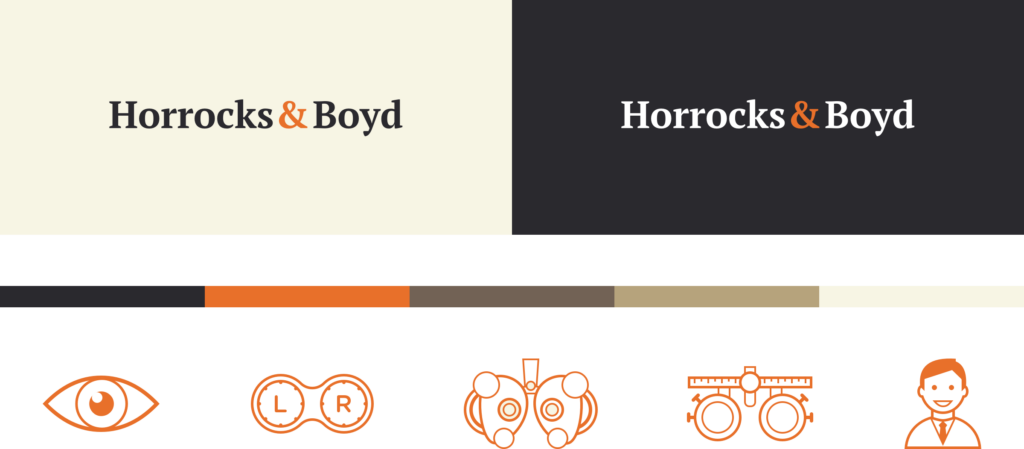
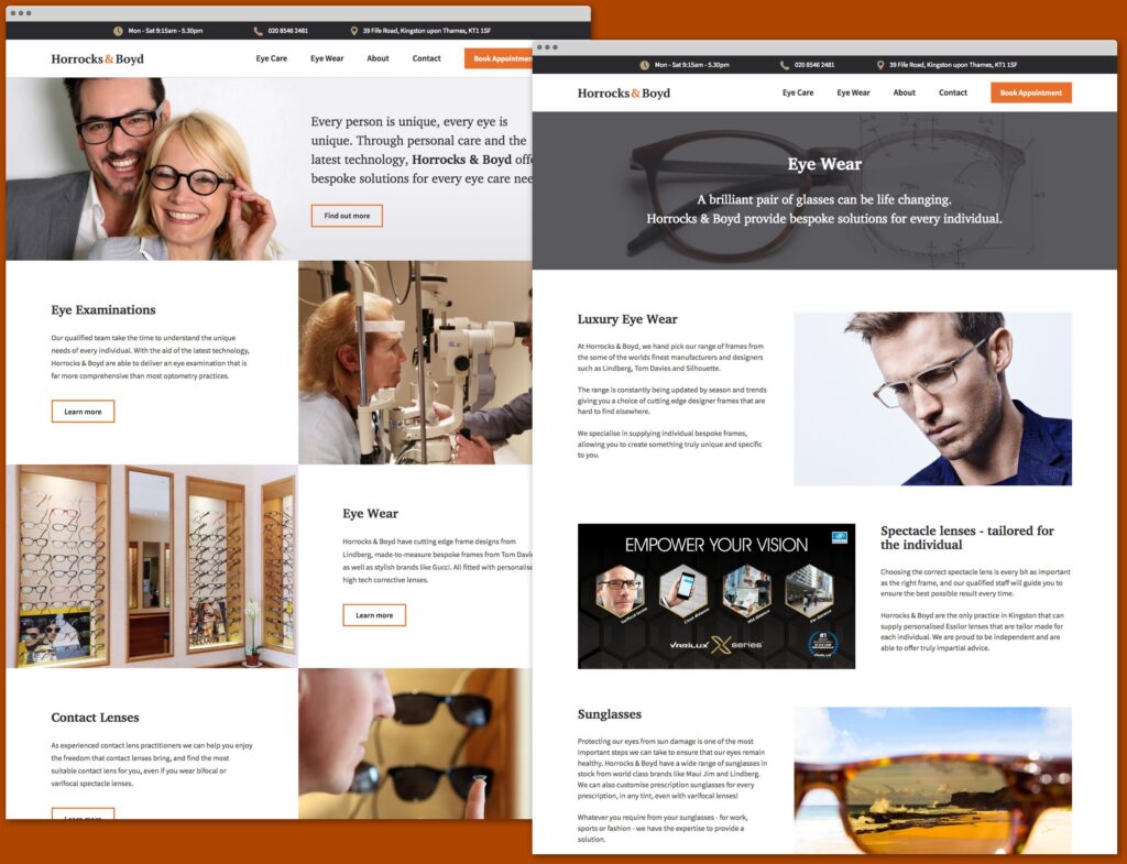
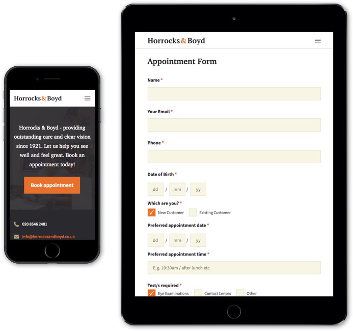
Rebranding & New Colour Palette.
Heritage. A word that held a strong focus during this phase. And whilst modern eye-for-design is part of the Figment approach, a sense of tradition was imperative. The new Horrocks & Boyd logo not only achieves this – with an original colour scheme and typeface – but provides a brand identity worthy of a company with such an outstanding reputation.
Love At First Sight. And Second.
Consistency is key. That’s why the fresh colour palette in Horrocks & Boyd’s new branding was utilised throughout the website design. The website itself keeps authenticity with a clinically clean style. Smooth retina-optimised graphics, custom-designed icons and a fast-loading navigation mean the site is a joy to use for customers of all ages.
Clear First Steps – a Better User Experience.
User experience is at the very heart of Figment’s design process. Having consulted with Horrocks and Boyd, Figment produced a truly accessible booking form that works perfectly across all devices. The impact? Increased website bookings and happy customers. Now that’s vision.
Dive straight into the feedback!Login below and you can start commenting using your own user instantly